
The business
They had become a construction-technology company serving sophisticated US clients.
The gap
They still looked like an early-stage business.
The business
Where the company had got to
ARK Simplify had grown beyond the way its existing brand and digital presence represented it. The business needed a clearer, more mature and more cohesive way to present its capabilities to an international B2B audience.
The gap
What buyers saw
The operational and technical capability of the business had progressed, but the external presentation still reflected an earlier stage. The brand and website needed to make the company easier to understand and more credible in the context of the clients it wanted to serve.
The idea
The one true thing we built it on
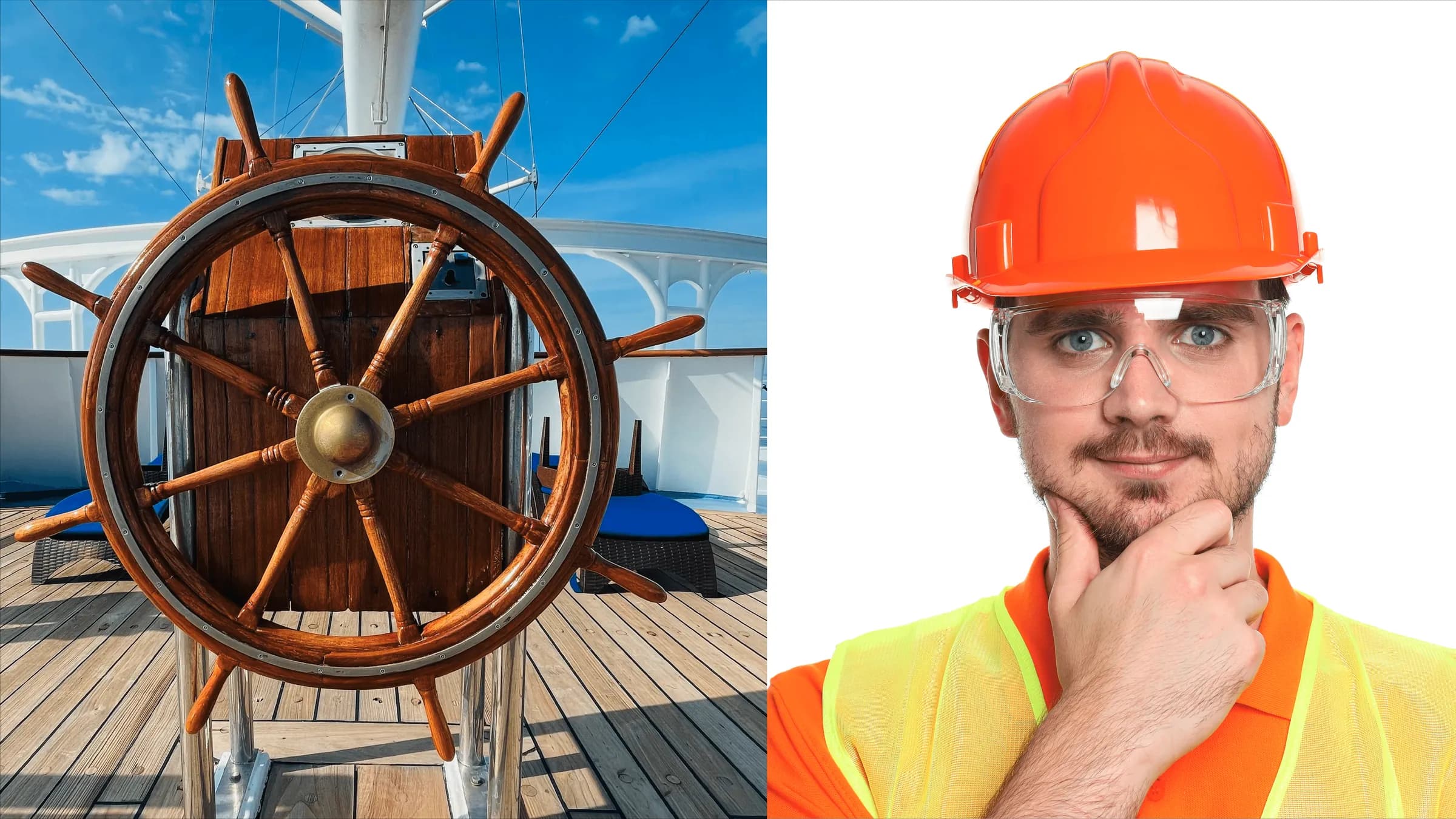
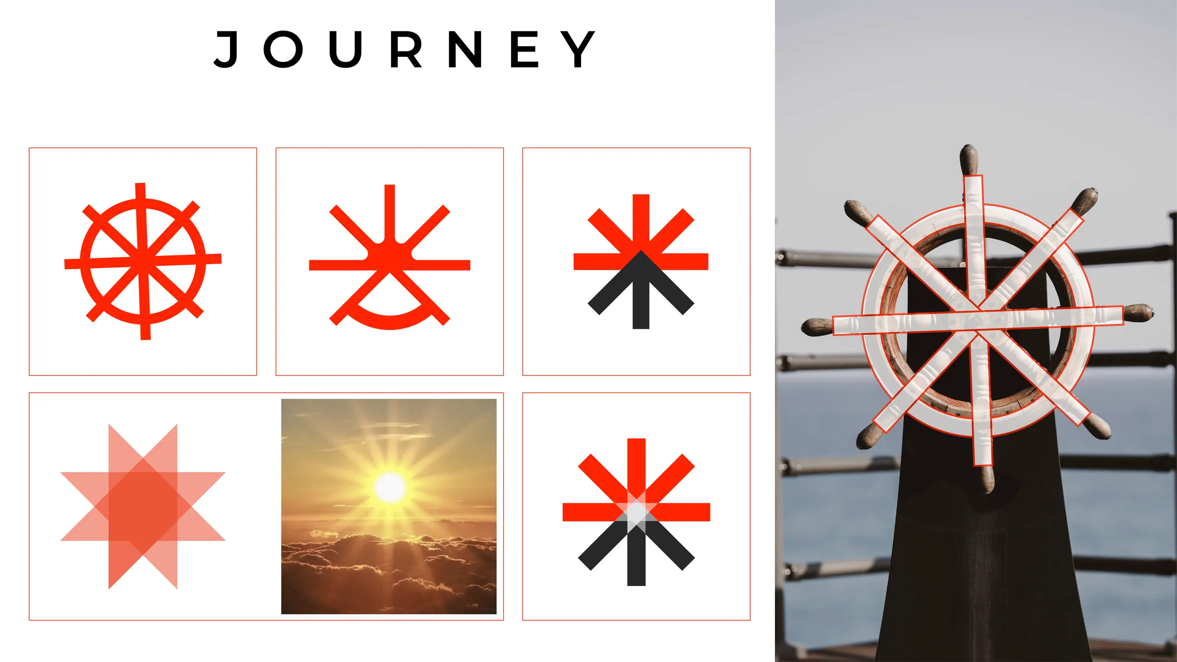
The mark grew from a ship’s wheel: the idea of steering complex construction work with clarity, reduced step by step into a single symbol.
The system
What we built, in use
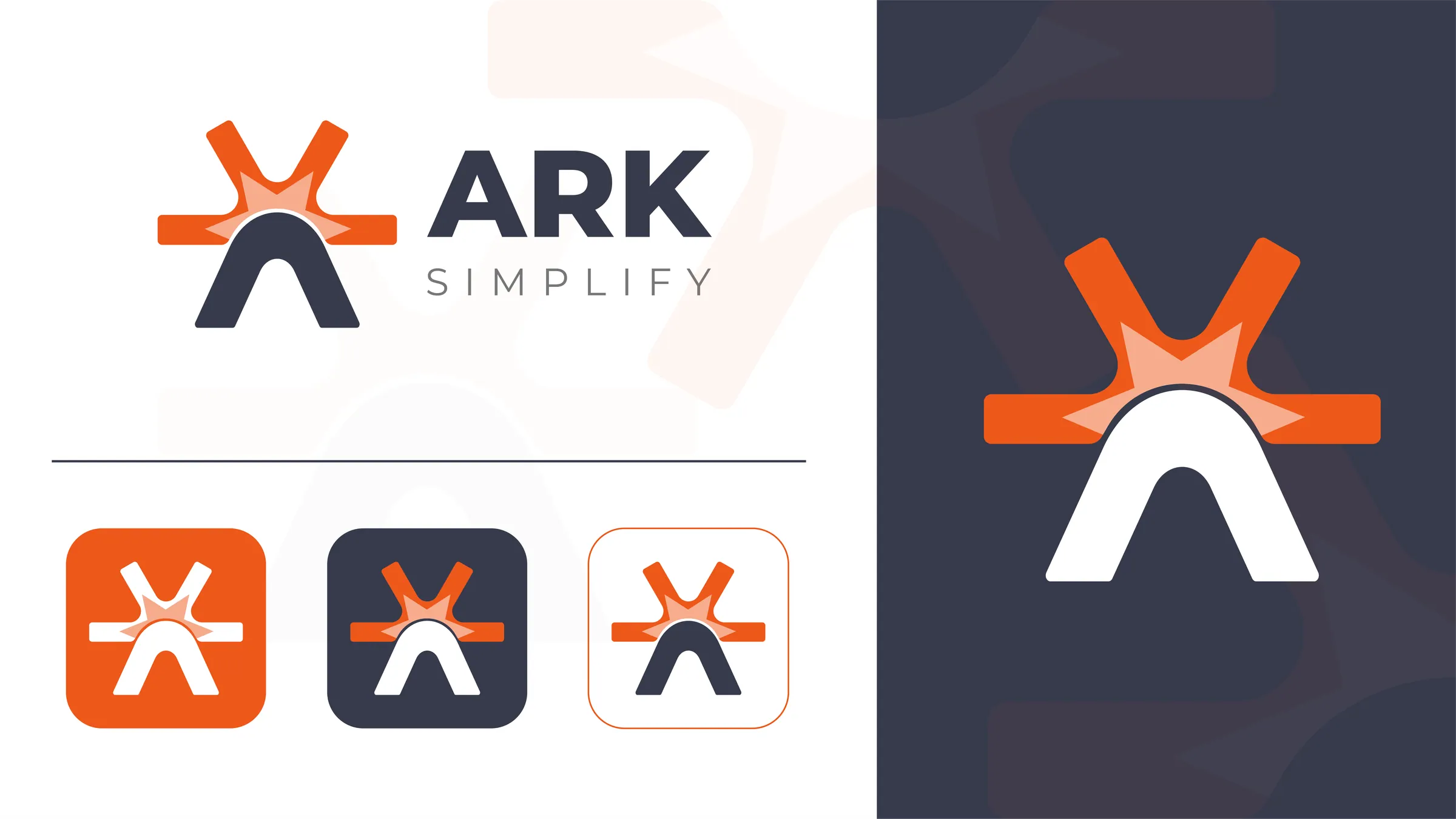
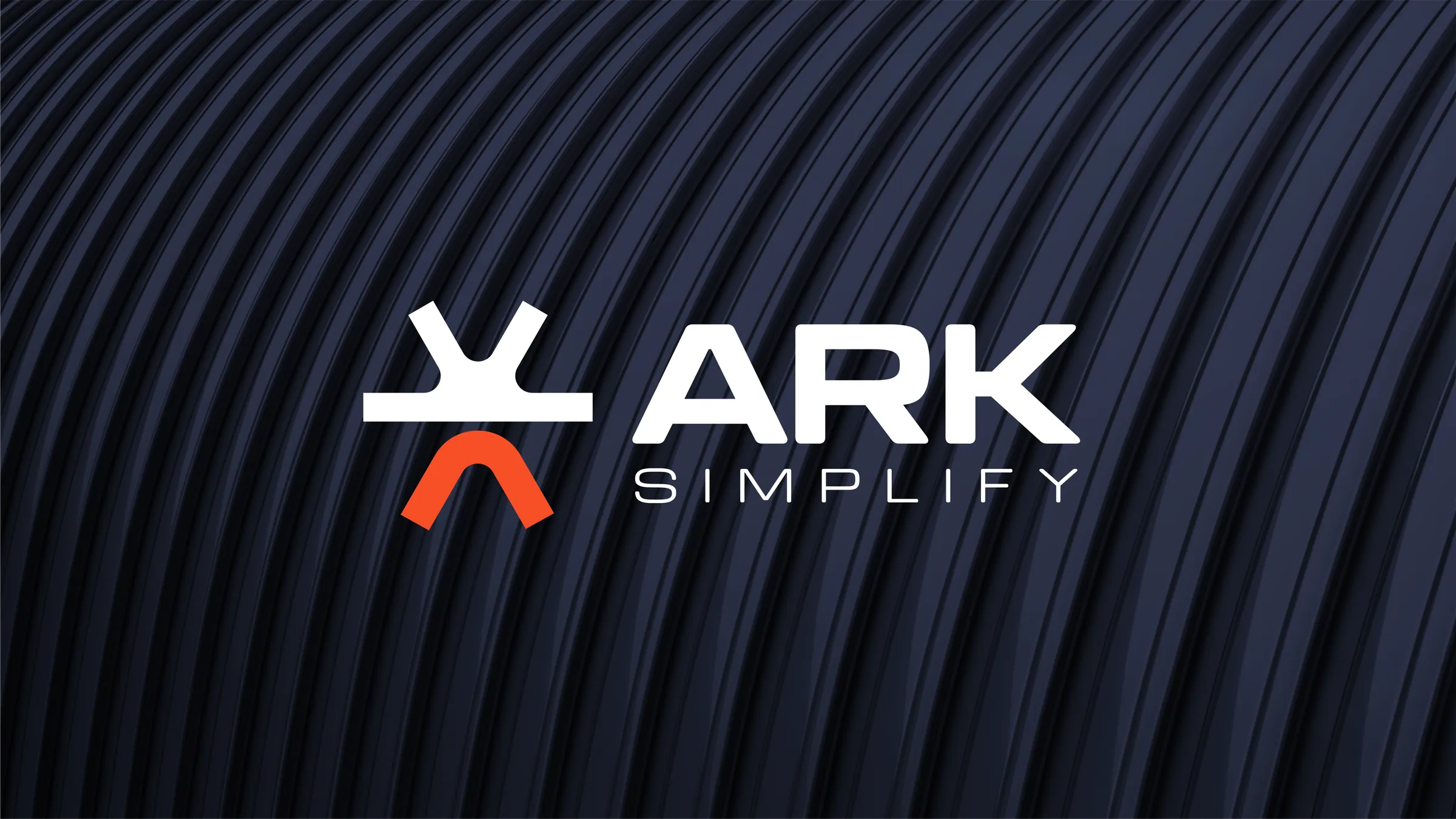
One idea carried through every touchpoint: the identity, the screens and the places buyers meet the company.
The result
What changed
The result was a more coherent international-facing brand and website system, with the company story, services and digital experience working in the same direction.
What was delivered
- Brand repositioning
- Brand identity and visual direction
- Messaging and communication hierarchy
- Website strategy and information architecture
- Website design
- Responsive frontend development
- Capability and service presentation
This project matches our Brand + Website scope.
See the three scopesMore on Construction & Construction Tech
Is your business ahead of its brand?
Tell us what changed. We look at your current presence first, so the call is about your business.