
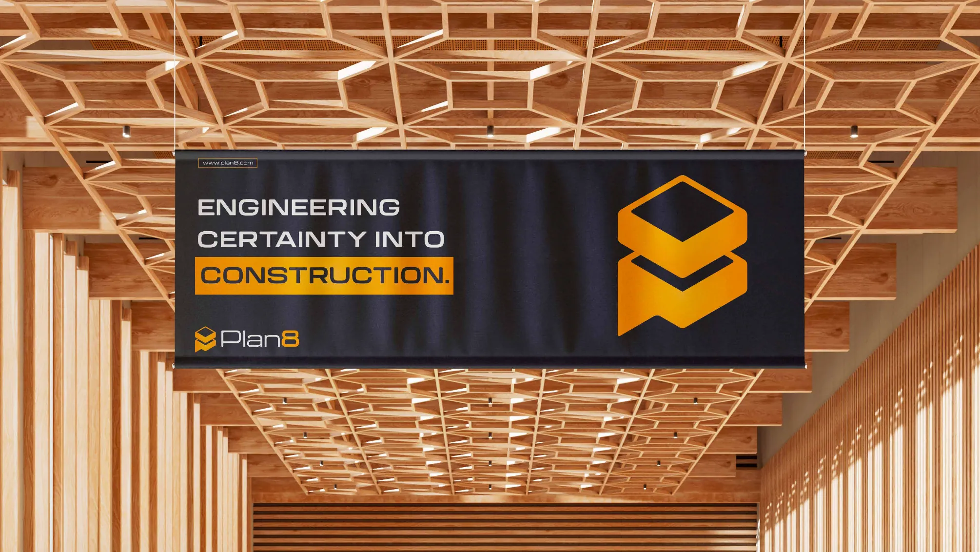
The business
They had become a specialist BIM/VDC business.
The gap
They still sounded like every other technical service provider.
The business
Where the company had got to
Plan8 needed a stronger position and identity for a construction-technology offer spanning areas such as Scan-to-BIM, VDC planning and coordination. The challenge was not only to look different, but to make a complex technical business feel commercially clear.
The gap
What buyers saw
The company operated in a technical category where many businesses use similar service language. A stronger identity and clearer service story were needed to make Plan8 feel more ownable and better organised.
The idea
The one true thing we built it on
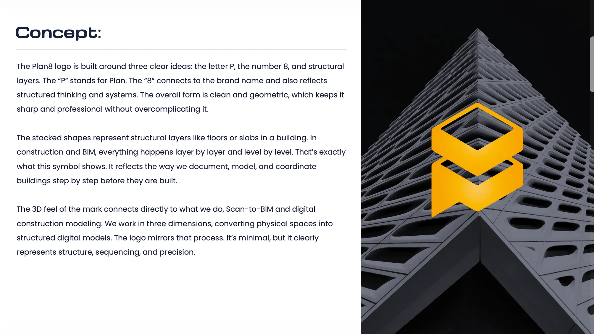
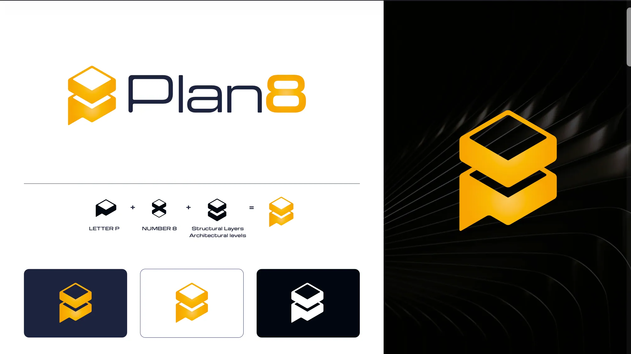
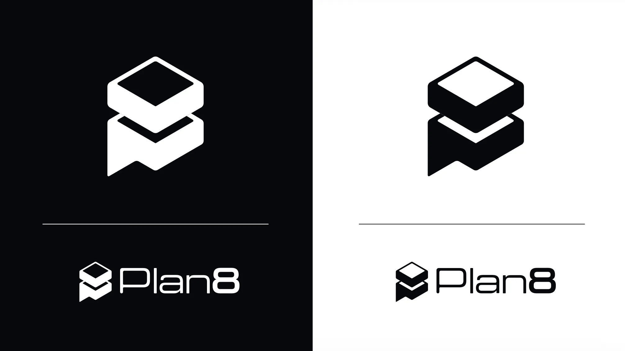
The mark is built from three ideas: the letter P, the number 8 and stacked structural layers, the way a BIM model builds a structure floor by floor.
The system
What we built, in use
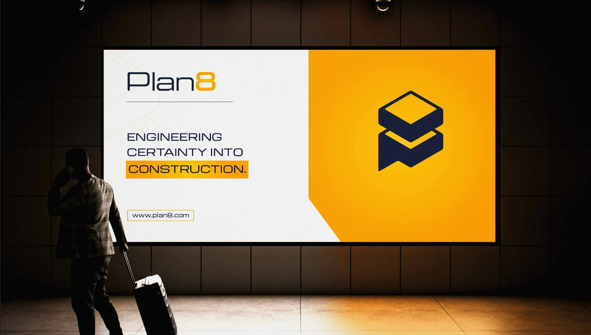
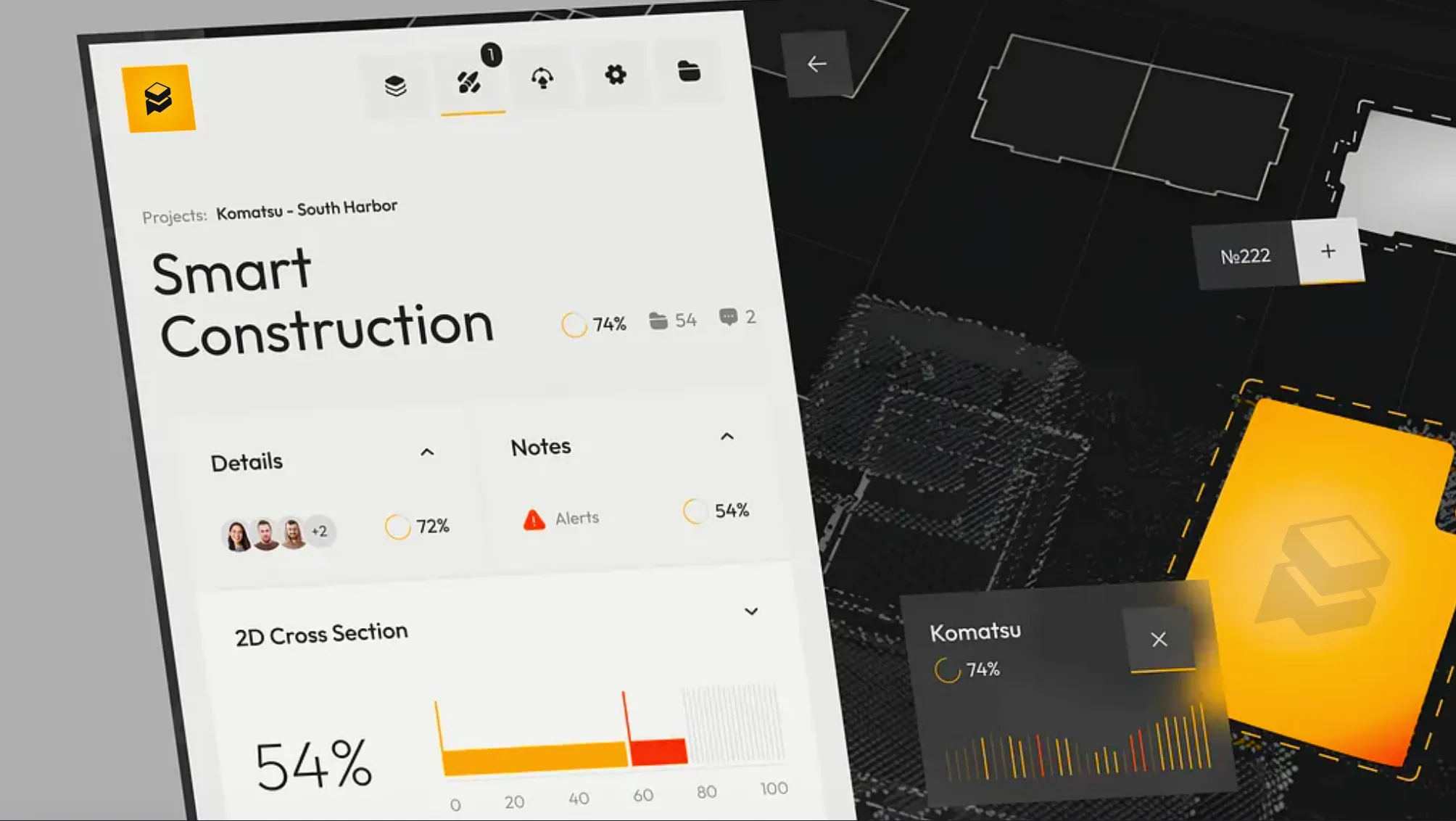
One idea carried through every touchpoint, at the scale buyers meet the company.

The result
What changed
Plan8 became a clearer construction-technology brand with a more distinct visual and verbal system for presenting BIM/VDC capability.
What was delivered
- Positioning direction
- Rebranding and visual identity
- Service communication
- Technical offer hierarchy
- Digital and website direction
- Visual storytelling around BIM and scan-to-model workflows
This project matches our Brand Rebuild scope.
See the three scopesMore on Construction & Construction Tech
Is your business ahead of its brand?
Tell us what changed. We look at your current presence first, so the call is about your business.