
The business
They had become a construction company with significant project work behind it.
The gap
They still presented themselves in fragments.
The business
Where the company had got to
NewFab had meaningful construction experience and significant project work, but its company presentation, services and proof were fragmented. The business needed a clearer way to organise what it did and show the scale of what it had already delivered.
The gap
What buyers saw
The quality of NewFab’s work was stronger than the way the company presented itself. Project evidence, service lines and company credentials needed to become easier for buyers to understand and trust.
The idea
The one true thing we built it on
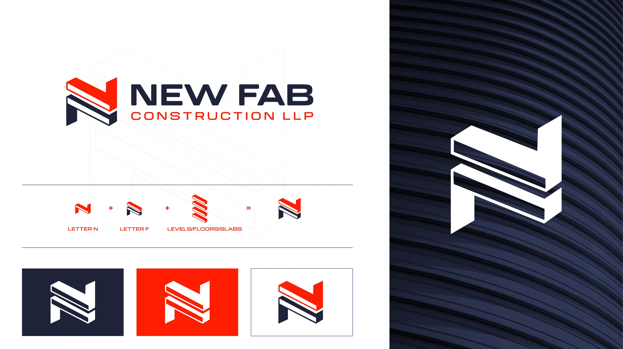
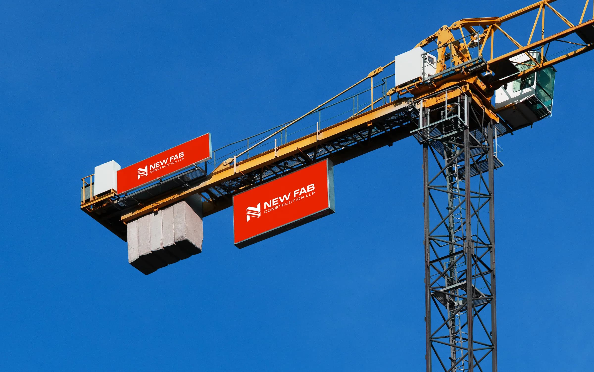
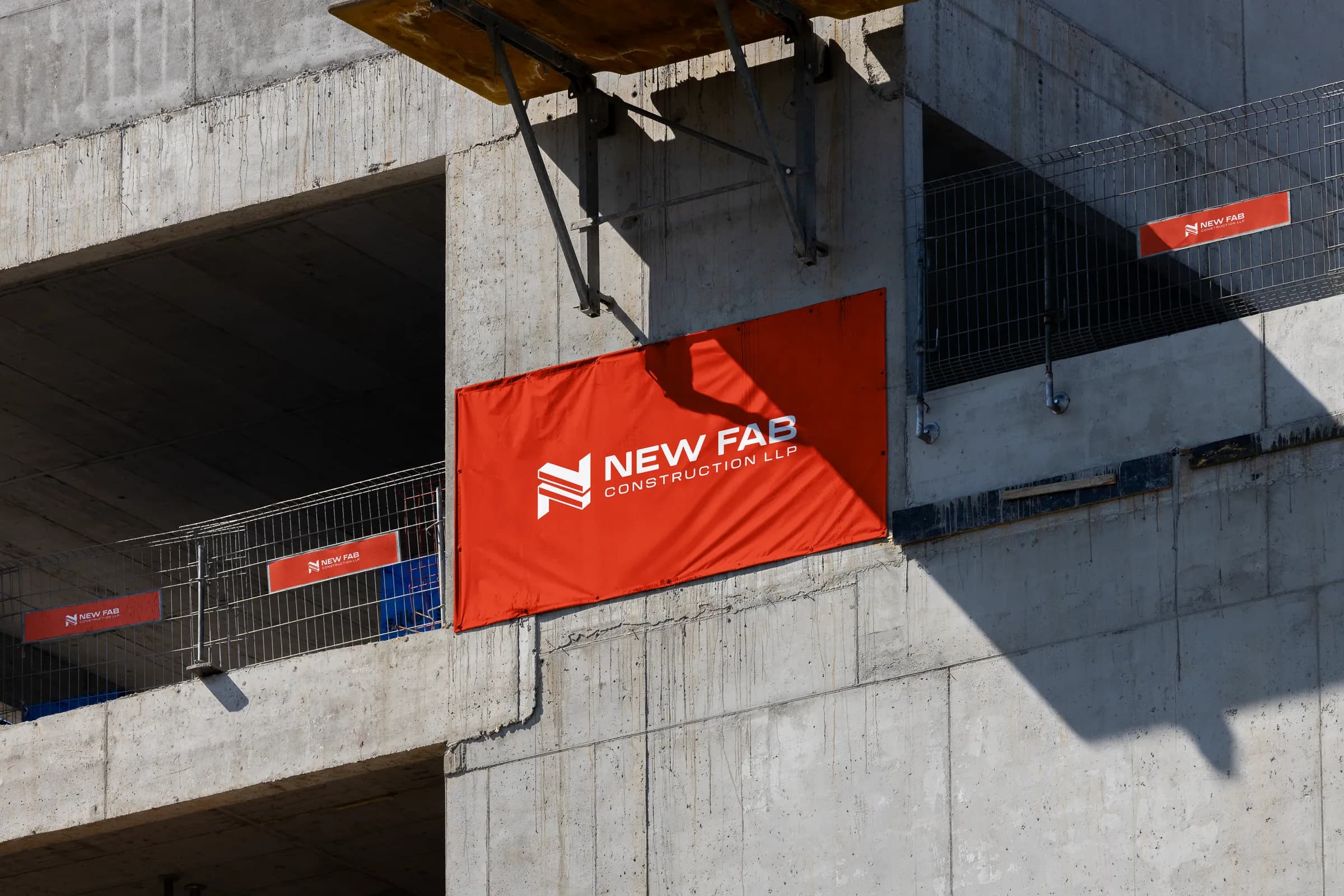
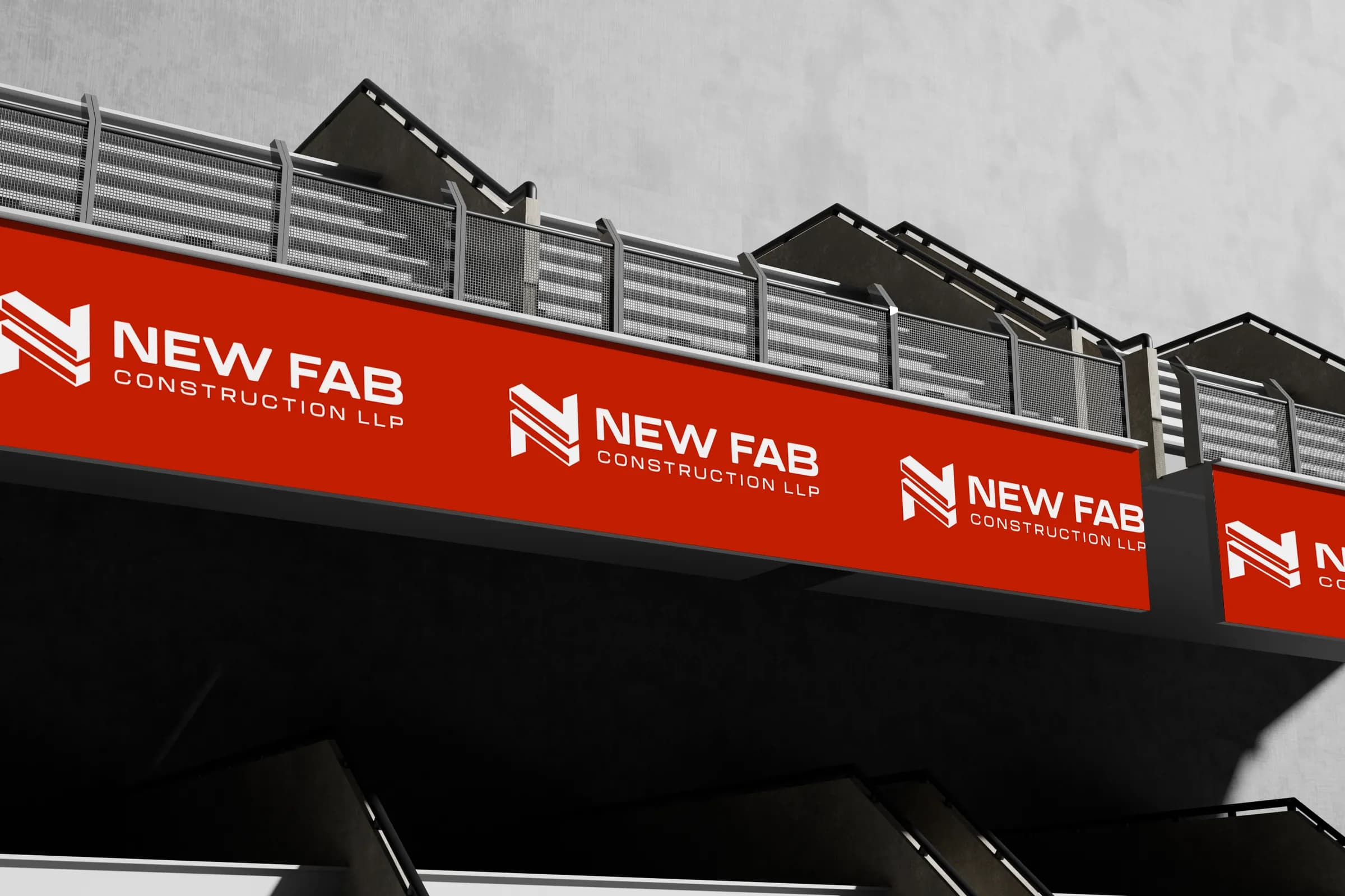
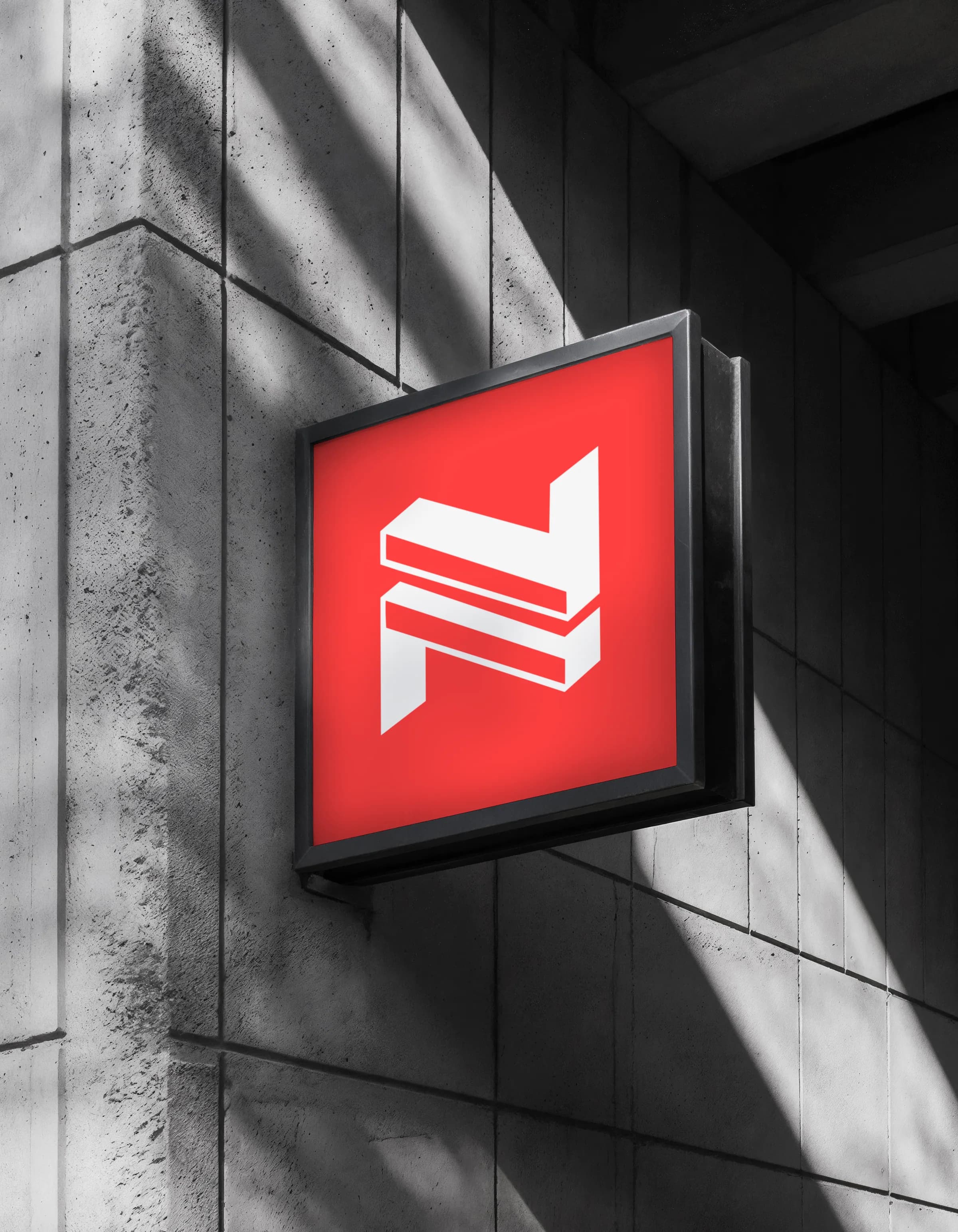
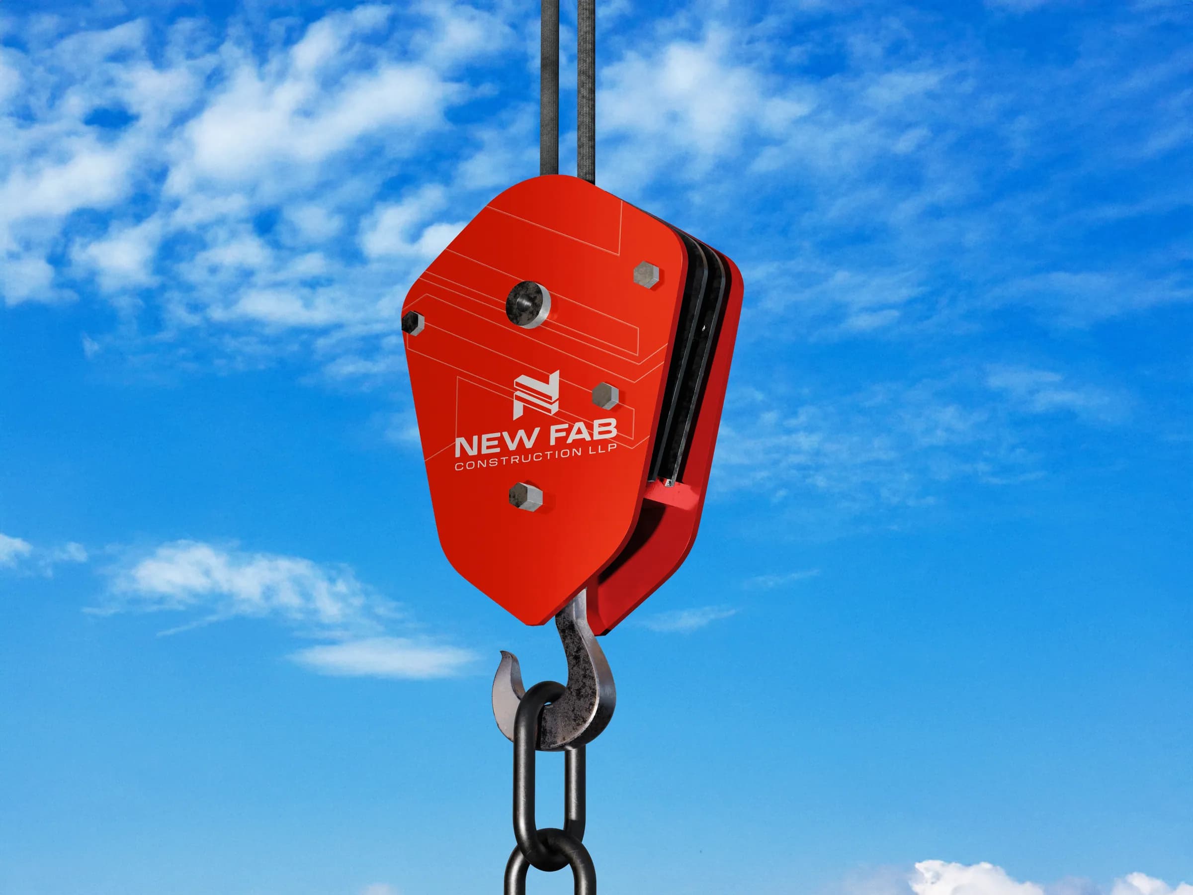
The symbol combines three things: the N of New, the F of Fab and stacked levels, the floors the company builds. One mark, drawn to hold up at the scale of a crane banner.
The system
What we built, in use
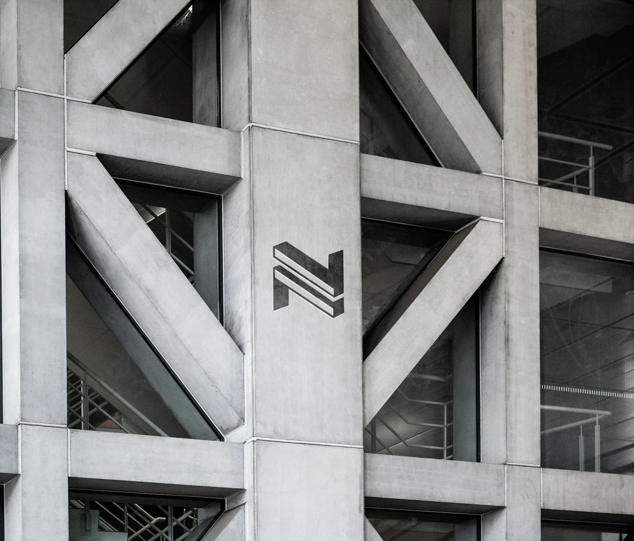
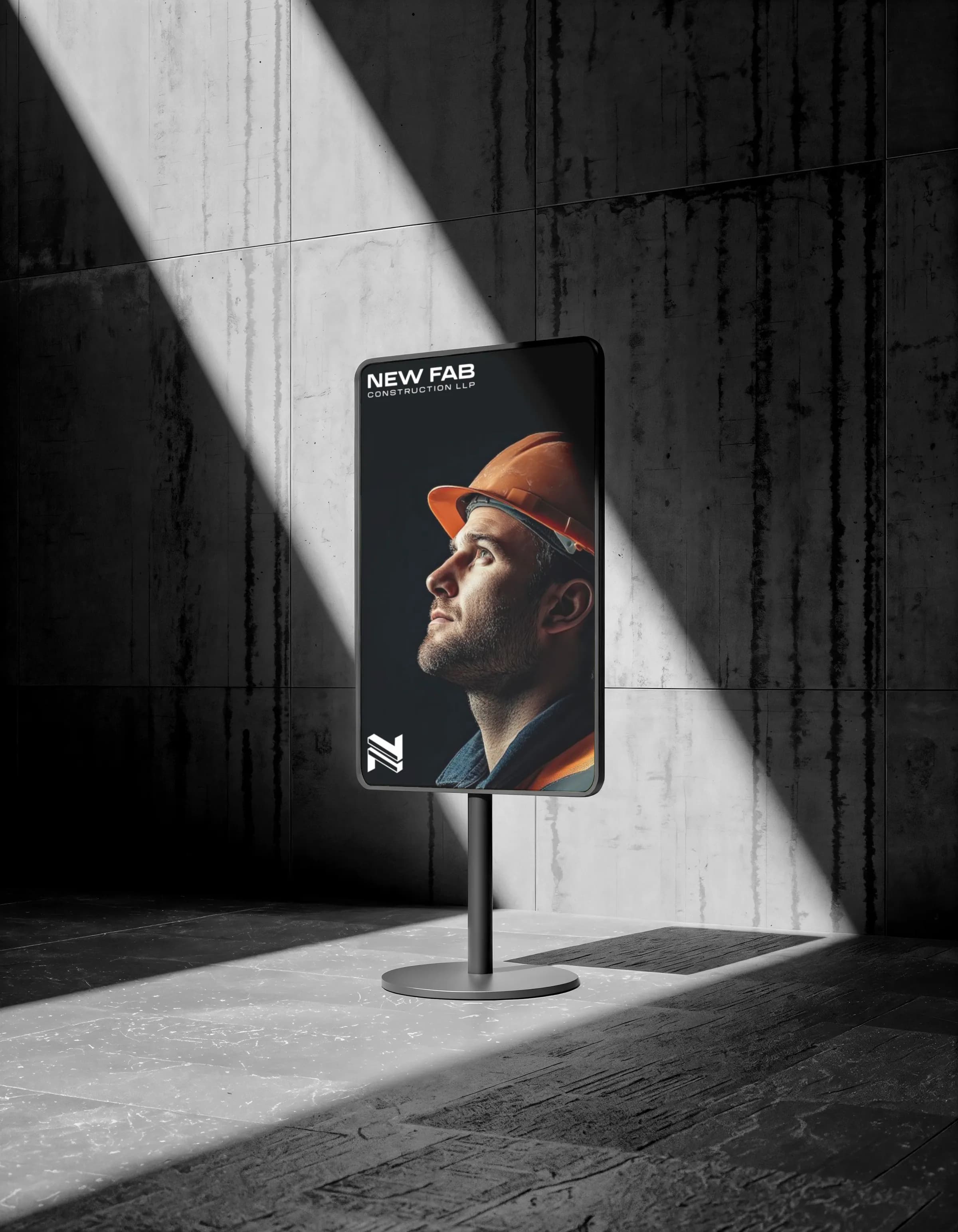
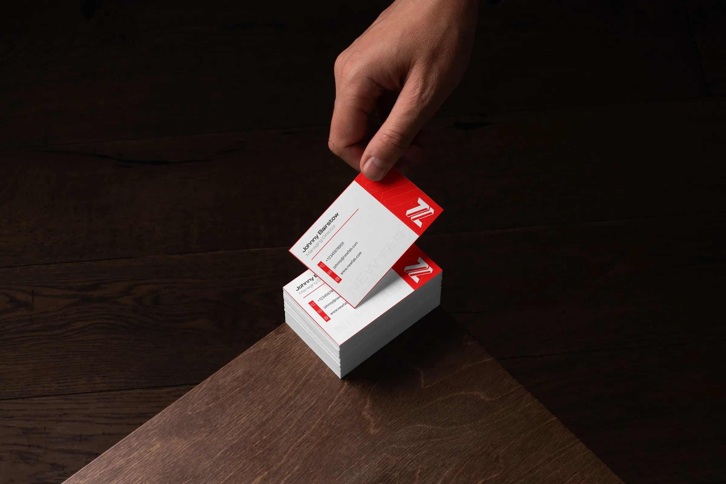
One idea carried through every touchpoint, at the scale buyers meet the company.
The result
What changed
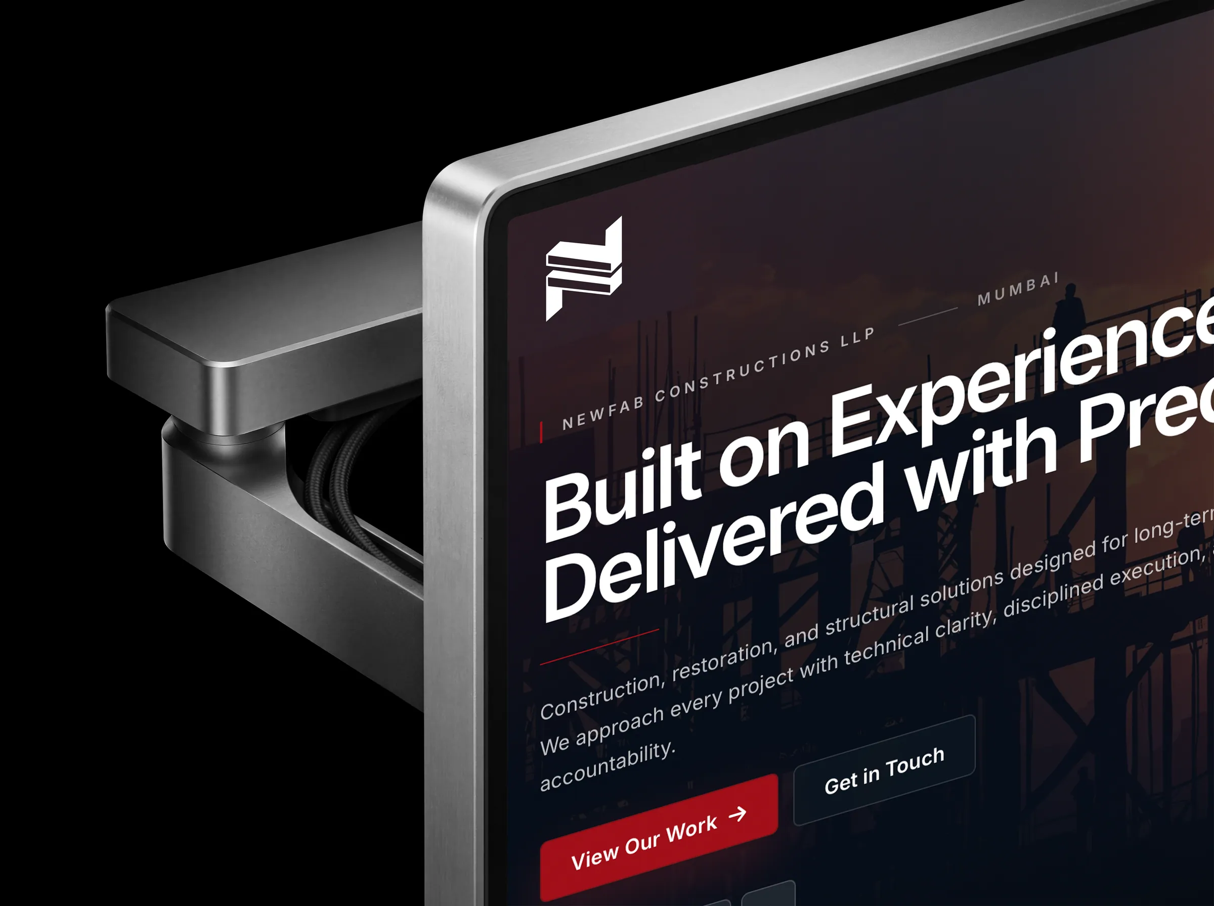
The resulting system organised the company around clearer services, stronger project proof and a more credible digital presence, giving the business a presentation that better matched its execution capability.
What was delivered
- Brand positioning
- Brand identity
- Service architecture
- Project and case-study structure
- Company communication
- Corporate website strategy
- Website design and development
This project matches our Brand + Website scope.
See the three scopesMore on Construction & Construction Tech
Is your business ahead of its brand?
Tell us what changed. We look at your current presence first, so the call is about your business.